Introduction
Happy New Year! 2016 was another great year for Overflow Data. To celebrate we have compiled a list of our 5 most popular data visualizations from the past year. We hope you enjoy this look back with us.
5) The Employment Status of Americans Visualized by Age
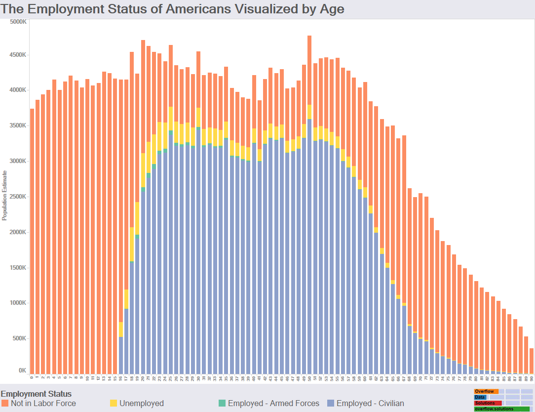
This year we started to create age distributions that showed various demographic traits on top of the population pyramid of the US. This particular visualization looks at the population with information about employment status coloring the graph. If you would like to take a closer look, you can find it here.
4) 2016 Fantasy Football Dashboard
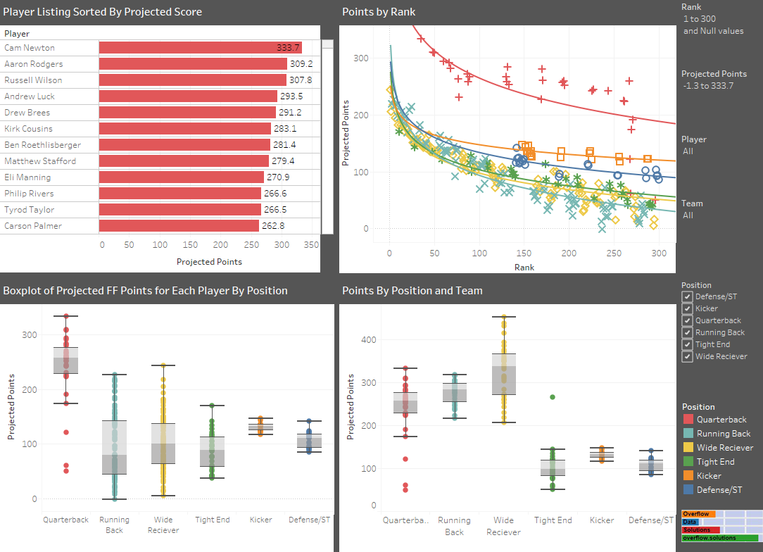
The 2015 Fantasy Football Dashboard was our most popular visualization of 2015. This year it was retooled and improved. This version saw similar success and it was great hearing back from people about how much it helped then in their Fantasy Football Leagues. If you want to see how the beginning of the year projections compared to how the season turned out, you can find this visualization here.
3) How Many Members of the US Military Have Died In Each War?
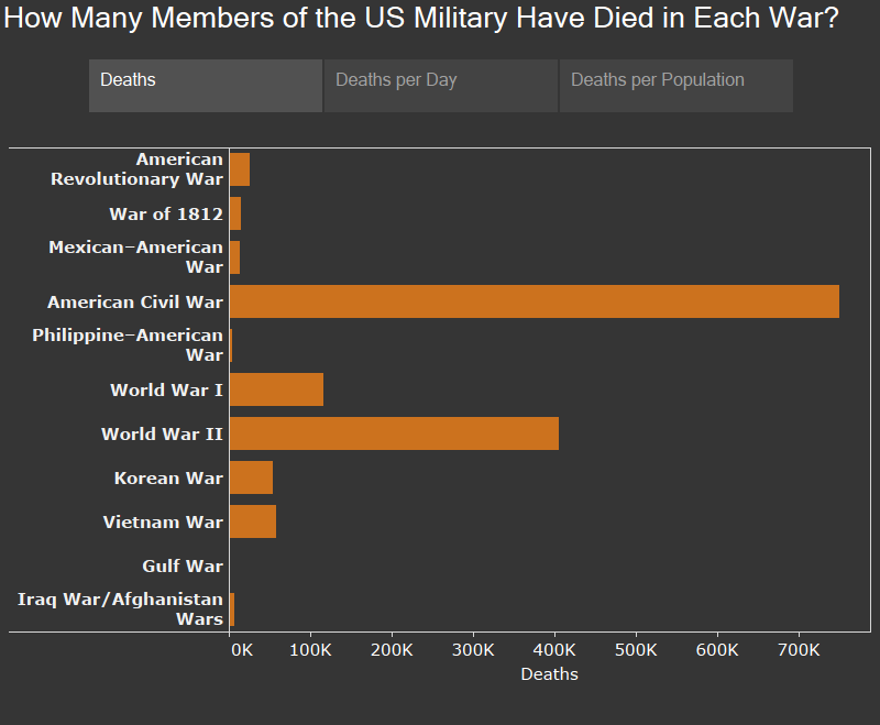
As a salute to those that have passed away in service of America I created this data visualization. It shows how many members of the Armed Forces have passed away in each war as well as some other telling metrics about Americas Wars.
2) How Do Americans Differ by Age
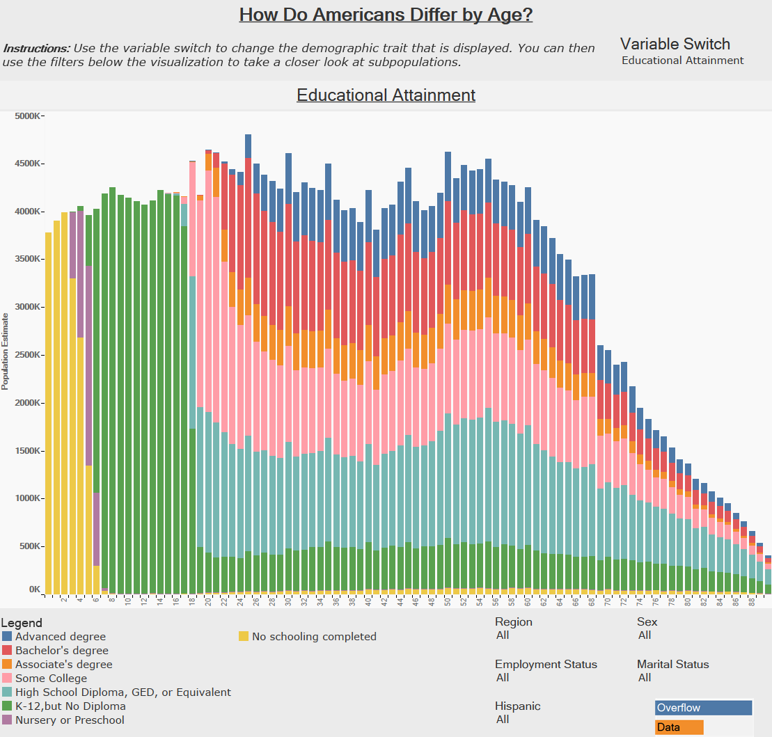
Since our age distributions were some of our most popular posts in 2016 were our age distributions. I decided to make the “How Do Americans Differ by Age?” data exploration tool. It takes more than 10 demographic traits and shows how they fall on a population pyramid.
1) The Age of Americans Married in the Past 12 Months
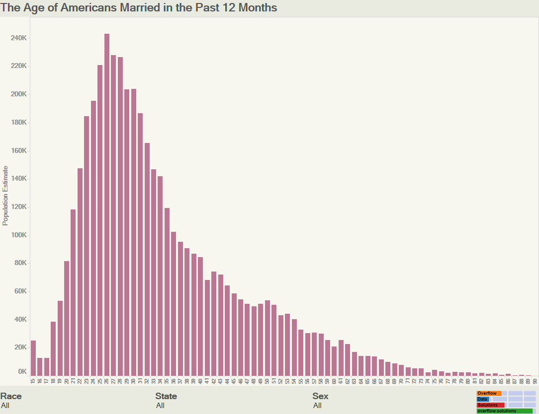
Our most popular age distribution and post of the year was this visualization that shows the number of people married in the past 12 months by there age. This helped to spur the idea of the “How do Americans Differ by Age” and various other graphics about marital status. If you want to take a closer look at this graphic you can find it here.
Conclusion
Thanks to everyone for all their support and taking the time to view our visualizations this year. The feedback we have gotten has been great and we appreciate all your comments. Happy New Year!