Introduction
2015 was a great year for us. We launched in late August and were pleasantly surprised with the huge response we got for some of our visualizations. As always we are extremely grateful for our viewers feedback they give us and we hope you enjoy a look back at our 5 most popular visualizations of 2015.
5) Percentage of Veterans With a Disability Compared with the Rest of the Population
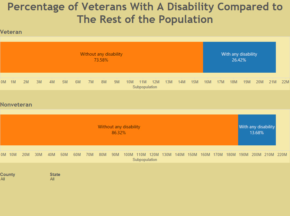
For Veterans Day, we sifted through all the data we could find from the Census Bureau about veterans. That ended up being a bit overwhelming, so we decided just to focus on disability status. Our post got a lot of attention and lead to an interesting conversation about this subject in r/dataisbeautiful.
4) How has the Median Age in the US Changed Over the Last 10 Years?
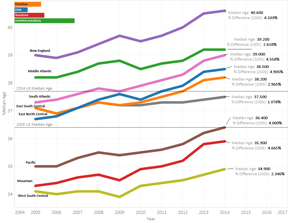
There is no denying that the demographics of the US are changing. One of the changes that we are most interested in are changes in the age. This visualization compared how the median age has changed in different areas of the US using Census Bureau data and geographical divisions.
3) What Percentage of Their Income Do People Spend On Rent In Each County?
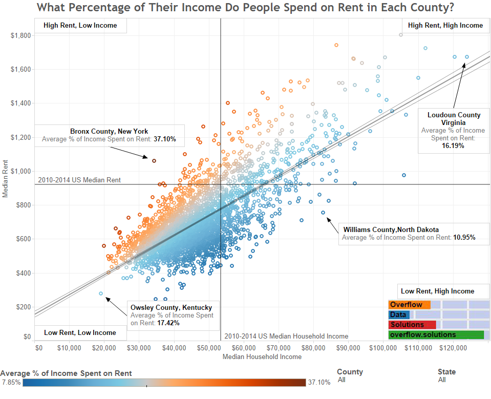
My favorite visualization of the year compared household income with the median rent in each county in the US using Census data. If you want to take a look at how your county compares you can access the interactive version of this visualization here.
2) The Net Worth of All The Presidential Candidates
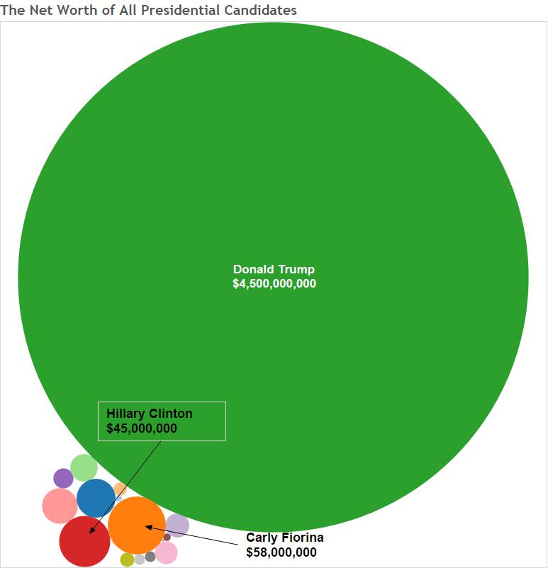
What I thought was one of my more silly visualizations of the year got a whole lot of attention. It got so much attention it lead to a flame war with a site that republished that visualization without permission. If you want to view the visualization the was created with data from Forbes, you can view the original article here.
1) Fantasy Football Draft Dashboard
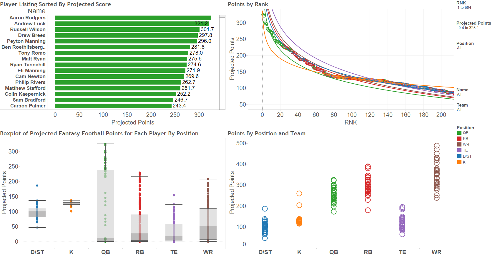
Our most popular was our Fantasy Football Draft Dashboard. It let you see how many points were projected by ESPN, how that compares with other players and how each team was going to do at each position. I felt like I had a great draft, but could of had a better year in my Fantasy League after missing the playoffs at 7-6. At least all of you seemed to enjoy it! If you want to take another look at it, you can find it here.
What to Expect in 2016
In 2016 we are planning on offering more of the same and improving where we can. We are currently running surveys asking our viewers to tell us about their New Year’s resolutions and their favorite NFL Team. We are going to continue performing data analysis on on other data sources as well.
If you want to keep up with our surveys and data analysis in 2016, be sure to follow us on Twitter and Facebook.
HAPPY NEW YEAR!
![]()
Leave a Reply