Visualization
Mobile Users: If you are having issues using the interactive version of this visualization, you can find a static version of it here.
Data Notes
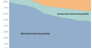
A couple weeks ago, I published a graphic showing how marital status changes with age. I decided to do another one showing how employment status changes as well. This visualization uses Tableau to show the employment status for every age.
The data for this visualization comes from the American Community Survey which is completed by the US Census Bureau. I used the 2014 One Year Estimates Public Use Microdata Sample which can be found on the ACS Website.
If you want to keep up with our surveys and data analysis, be sure to follow us on Twitter and Facebook.
The Employment Status of Americans Visualized by Age https://t.co/Xfv9Uf7Frs pic.twitter.com/mTKd7BLPm1
— Overflow Data (@overflow_data) August 1, 2016


6 Comments
Pingback: Americans' Employment Status, By Age
Is this chart the U3 or U6? Is the U6 data where the “Not in Labor Force” data came from? I know data for this might be hard to find, but I am betting that a lot of folks are only working part-time. I’d add another color for part-time work if data could be had.
Great Job
Pingback: VISUAL: Number Of Unemployed Americans By Age, State « 104.3 K-Hits Chicago
Thanks for finally talking about >The Employment Status of Americans Visualized by
Age <Liked it!
Why does this not show any 14 and 15 years old working? Or does this just reflect full time employment?
Funny peaks at ages divisible by 5. You should probably normalize to surrounding data.