
Visualization
Mobile Users: If you are having issues using the interactive version of this visualization, you can find a static version of it here.
Data Notes
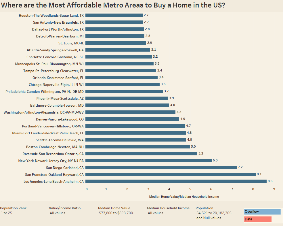
Last week, I created a visualization on how home value compares to income in each US county. That visualization mapped the data so I could see the geographic trends. It looked like all the places with higher ratios were focused around metro area so I made this visualization. It shows the ratio for the number of years worth of median income it would take to equal the median value of homes in that metro area.The dataviz starts by showing the 25 metro areas with the largest populations, but the filters can be used to adjust it.
To create this data visualization I gathered data from the American Community Survey. I used the 2015 ACS 1 years estimates from Table B25064, B25077, and B25071 on American FactFinder. I then manipulated the data in excel and used Tableau to visualize the data. If you are interested in the data used for this visualization you can find more data like it in our post the compare these points on a scatter plot.
If you want to keep up with our surveys and data analysis, be sure to follow us on Twitter and Facebook.
Where are the Most Affordable Metro Areas to Buy a Home in the US? #dataviz https://t.co/59O9sHRmZO pic.twitter.com/01uDQLoI81
— Overflow Data (@overflow_data) February 11, 2017
Leave a Reply