
Visualization
Mobile Users: If you are having issues using the interactive version of this visualization, you can find a static version of it here.
Data Notes
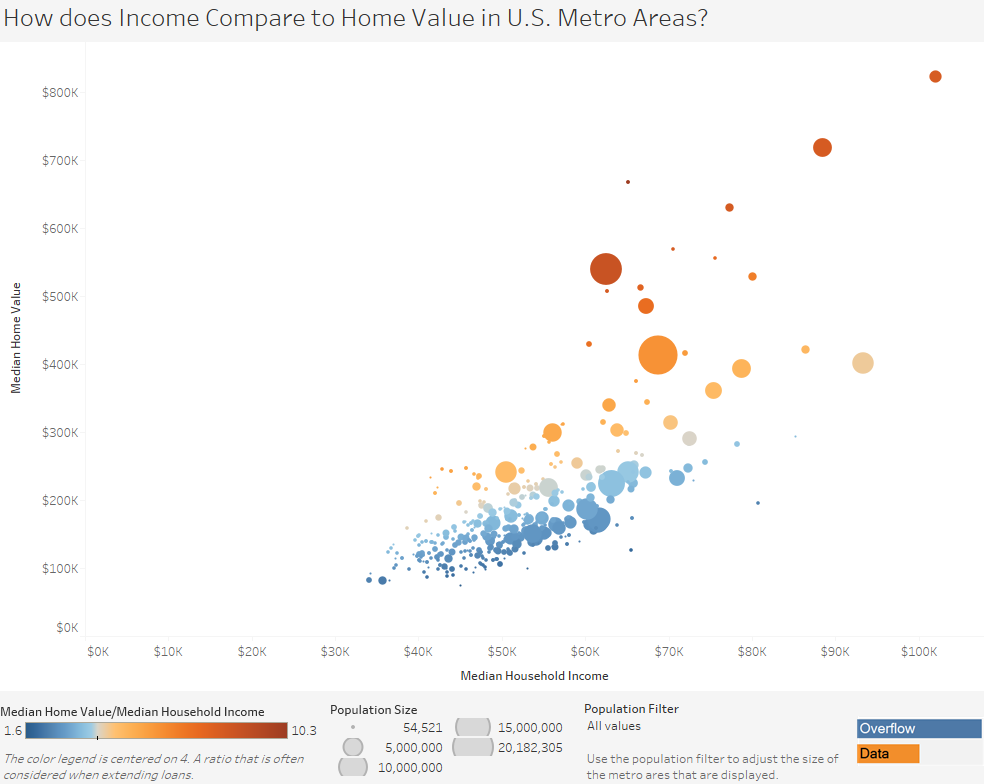
I recently created a visualizations on how income compares to the price of rent and the value of homes for counties in the U.S. I decided to take this a step further and compare income to the values of homes in U.S. metro areas. The visualization above shows this relationship and is color coordinated by the number of years worth of median income it would take to equal the median value of homes in that area.
To create this data visualization I gathered data from the American Community Survey. I used the 2015 ACS 1 years estimates from Table B25064, B25077, and B25071 on American FactFinder. I then manipulated the data in excel and used Tableau to visualize the data.
If you want to keep up with our surveys and data analysis, be sure to follow us on Twitter and Facebook.
How does Income Compare to Home Value in U.S. Metro Areas? #dataviz https://t.co/YmN6f8BOCd pic.twitter.com/XwKPjlV1Rn
— Overflow Data (@overflow_data) February 25, 2017
Leave a Reply