
Visualization
Mobile Users: If you are having issues using the interactive version of this visualization, you can find a static version of it here.
Data Notes
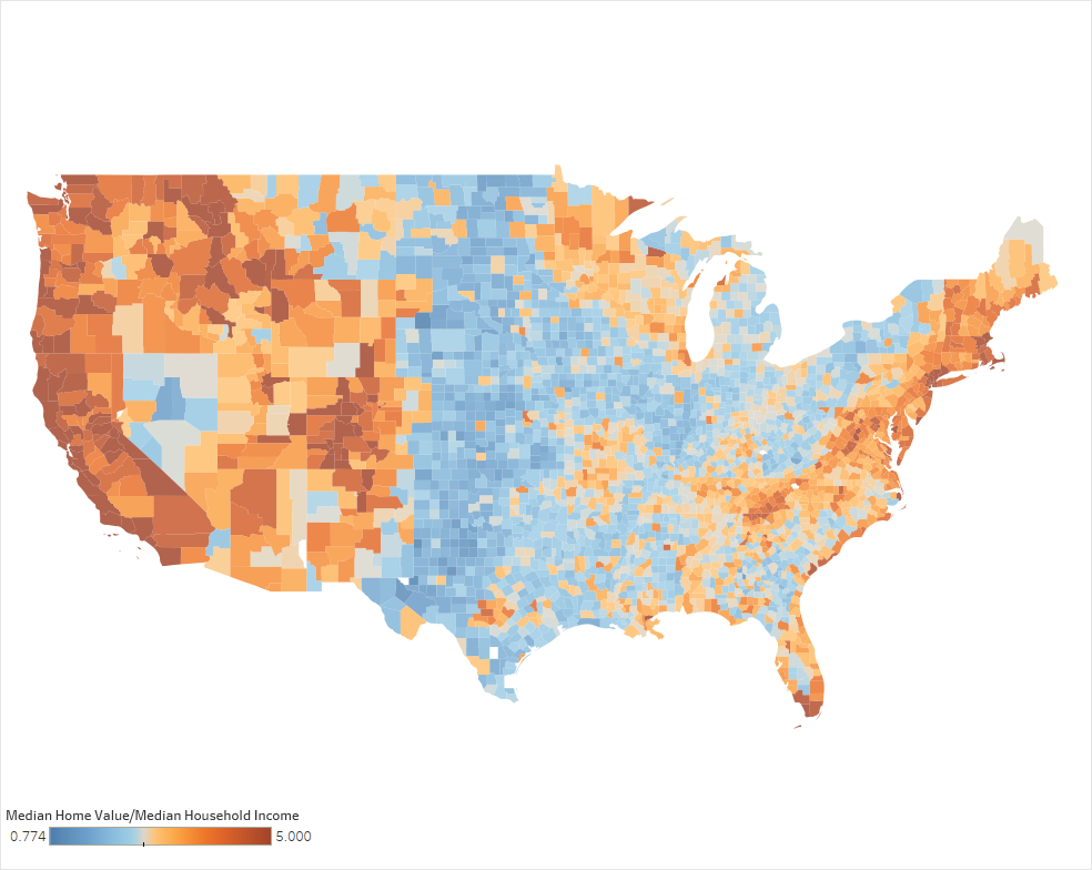
I recently created a visualization on how home value compares to income in each US county. That visualization was a scatter plot that showed how the two increased almost evenly. I decided to take this data and map it so i could see the geographic trends. The visualization above shows this relationship and is color coordinated by the number of years worth of median income it would take to equal the median value of homes in that area.
To create this data visualization I gathered data from the American Community Survey. I used the 2011-2015 ACS 5 years estimates from Table B25064, B25077, and B25071 on American FactFinder. I then manipulated the data in excel and used Tableau to visualize the data. If you are interested in the data used for this visualization you can find it here. It is the same set that I used for “How Income Compares to Rent in Each US County”.
Since the most expensive areas seemed to focus on metro areas I decided to make a bar chart that shows the most affordable metro areas to buy a home.
If you want to keep up with our surveys and data analysis, be sure to follow us on Twitter and Facebook.
How Large are Incomes In Each US County Compared to the Value of the Homes? #dataviz https://t.co/xrVkHsXCcD
— Overflow Data (@overflow_data) December 20, 2016
Leave a Reply