
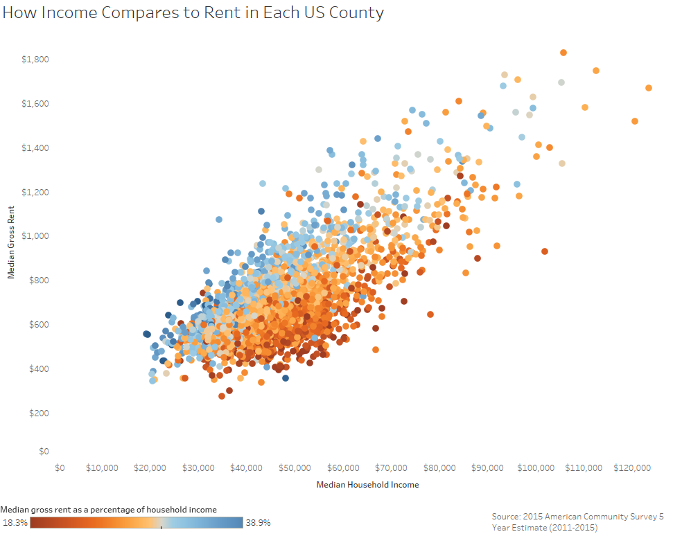
Visualization
Mobile Users: If you are having issues using the interactive version of this visualization, you can find a static version of it here.
Data Notes
To create this data visualization I gathered data from the American Community Survey. I used the 2011-2015 ACS 5 years estimates from Table B25064, B25077, and B25071 on American FactFinder. I then manipulated the data in excel and used Tableau to visualize the data. If you are interested in the data used for this visualization you can find it here.
If you want to keep up with our surveys and data analysis, be sure to follow us on Twitter and Facebook.
How Income Compares to Rent in Each US County #dataviz https://t.co/YYj4GXfwsP pic.twitter.com/6fKraXellN
— Overflow Data (@overflow_data) December 17, 2016
Leave a Reply