Visualization
Mobile Users: If you are having issues using the interactive version of this visualization, you can find a static version here.
Data Notes
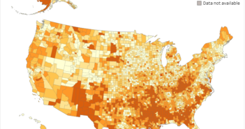
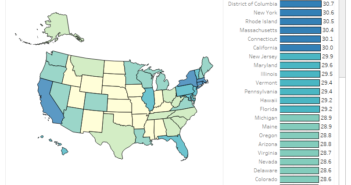
Last week, I was inspired by Reddit user, u/iturki27’s post of the “Worldwide Human Sex Ratio” to create a map that showed the gender ratio of the states and counties in the Continental U.S. While I was making that I realized that there are some major differences in the data if you control for age range. That is when I decided to make this graphic which shows the differences.
I used American Community Survey data which is compiled by the U.S. Census Bureau for my dataset. I gathered the 2011-2015 estimates from Table B01001 which can be found at American FactFinder. I then used Tableau to create the visualization.
If you want to keep up with our surveys and data analysis, be sure to follow us on Twitter and Facebook.
The Male to Female Ratio of America by Age Range #dataviz https://t.co/Wab7ffVHKU pic.twitter.com/YBQ4eMFvUs
— Overflow Data (@overflow_data) January 16, 2017


