[accordions]
[accordion title=”A Note for Mobile Users” load=”hide”]How to integrate mobile users in the visualization realm continues to be an issue for users and creators. At this current time we are only publishing desktop ready versions of our graphics. That doesn’t mean we don’t want you to see them. We just hope that you use the sharing features below to facebook, tweet, or email yourself the link so you can enjoy the visualization later. A mobile friendly version of this data is located here[/accordion]
[/accordions]
Visualization Controls and information
Maps
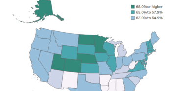
You can use the maps on the side to filter the results of the survey. Just simple click on a state or country. When you are done with the filter just click another location or click somewhere without any data to reset it. If you want to zoom in on a location or move the map you are able to do so.
Bar Chart
The results can also be used as a filter. Simply click on a team and the maps, gender, and counts will adjust to show you information on these fans.
Gender
You are able to filter the results by gender so you can see the differences between the sexes. You can do this by simply clicking the circles that represent each gender.
Count
This field shows how many responses are included in the visualization. This can vary based on the filters that are activated.
If you want to keep up with our surveys and data analysis, be sure to follow us on Twitter and Facebook.


