
Introduction
Last week we decided to ask r/samplesize and r/nfl who there favorite NFL Football Team is. We were extremely happy with the response and were able to gather nearly 1,500 responses. Below we have presented the results of the of the survey.
Basic Results
Treemap
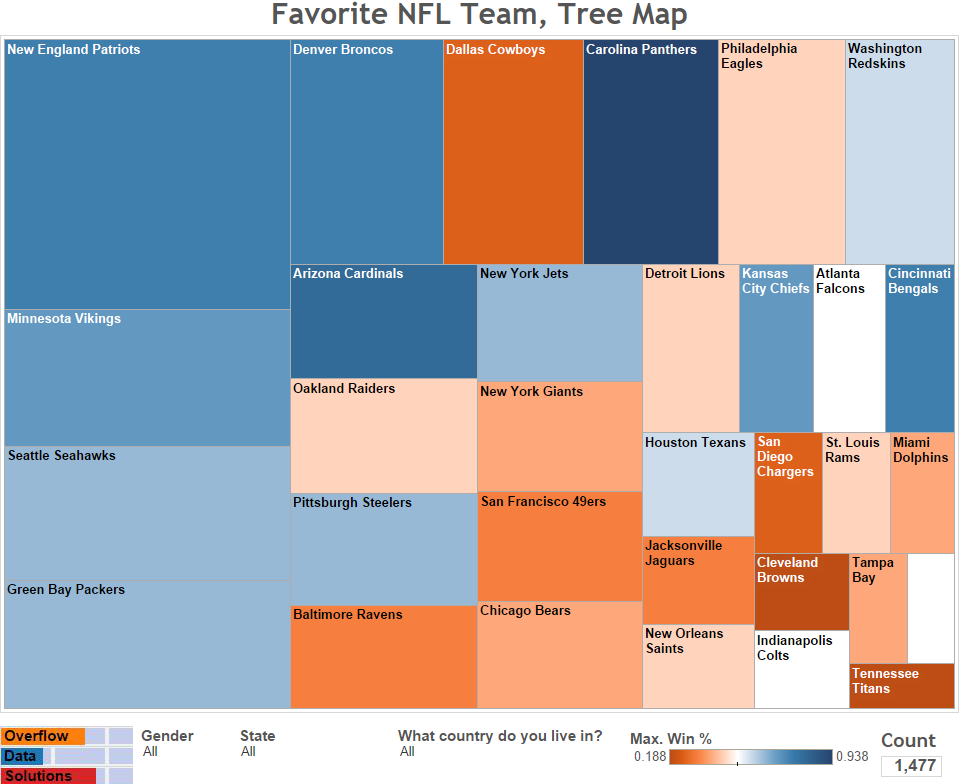
The first chart we would like to present is our tree map. It shows what percentage of the survey group choose each team, by the area that the team takes up within the graphic. The color then shows the win percentage for each team. Teams in white have a .500 record, teams above that are in blue, and teams below that are in orange. This quickly allows you to see who are the popular teams that have winning records and the opposite.
An interactive version of this chart is available if you are interested in using the pictured filters.
If you are interested in a more standard representation of this data it is provided below.
Bar Chart
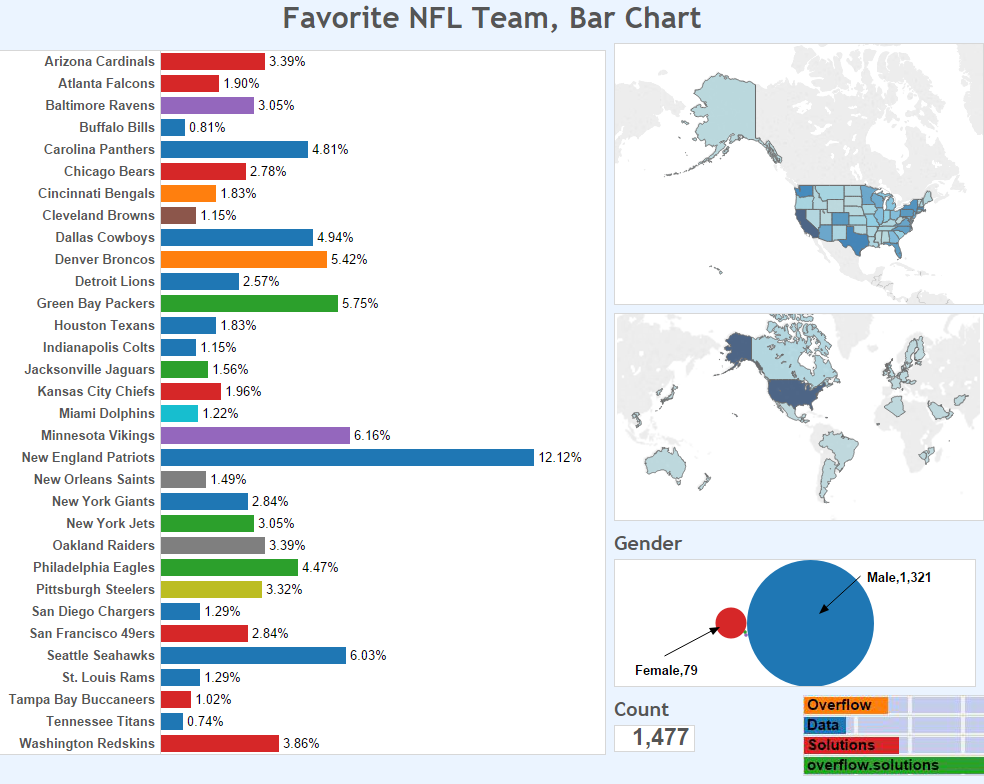
The bar chart makes it a little more clear what percentage of the total each team received. We have also included maps that show how many responses came from each state and country. Finally, we added a gender chart to show what gender the respondents were.
All of these visualizations can be used filters so you can dig further into the data.
Analysis
Original Analysis Question
Originally, I wanted to determine if more people rooted for a team within their state then teams outside their state. I quickly realized this would likely be a lot of data keying and manipulation. Since I wanted to share these results I decided I would address another question.
Do Wins Lead to Popularity?
It is a nearly undeniable fact that wins bring popularity. Below, we created a visualization that shows exactly how strong that relationship is.
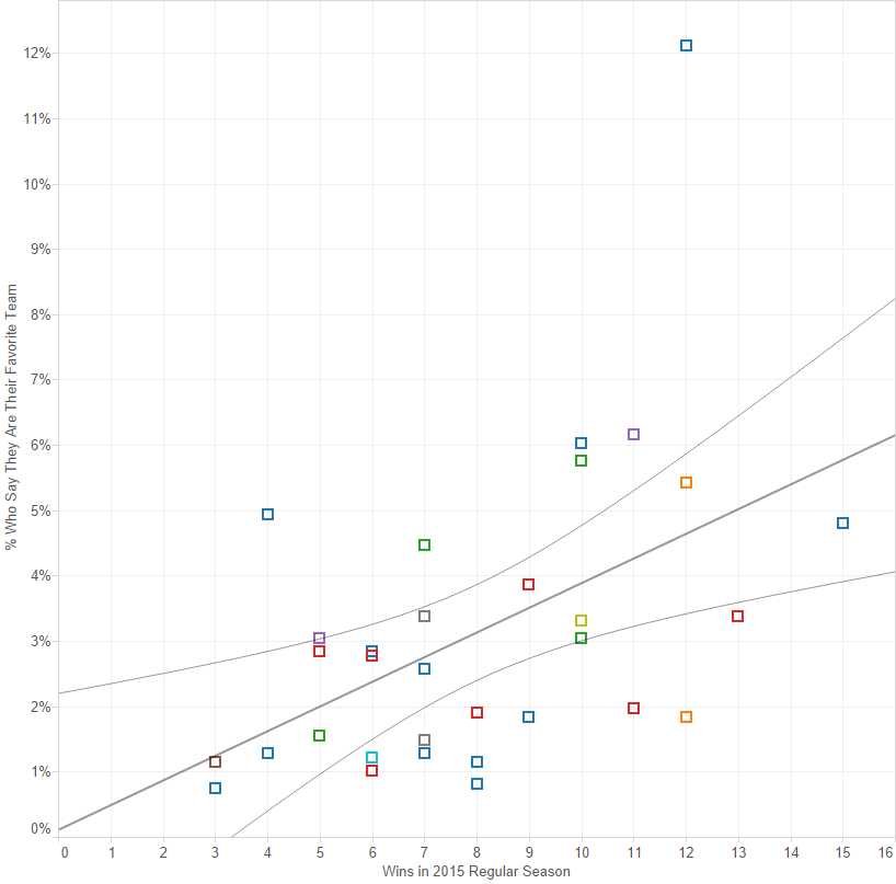
It appears that a statistical relationship does exist between how many wins you had this season and who people said their favorite teams were. This definitely isn’t a perfect relationship though and something that can be influenced by a number of factors such as previous seasons, Super Bowl wins, and locality.
If you would like to take a closer look at this, check out the interactive version of this visualization.
We plan on releasing further analysis on this subject later this week, so be sure to check back.
Data Notes
The data for this survey was gathered using google forms. The survey is available here, but please be mindful that the survey is still live and collecting data. Please do not submit test data.
The data was then taken from Google Sheets and cleaned in Excel. There was an issue, with a large number of people entering what they believed were humorous genders and ages. While they may have been comical, it prolonged the data cleaning process.
Finally, the data was loaded in Tableau where the visualization was created. We plan on continuing to use the visualizations to update the results of the survey in the future.
Further Interactions
We were extremely happy to see so many people interested in this survey and the suggestions we got. One of the suggestions that we received is that we should keep running it to see how the results change given different situations. We would love for you to take the survey for the first time or again here. We just ask that you indicate whether or not this is your first time taking the survey when asked.
If you want to keep up with our surveys and data analysis, be sure to follow us on Twitter and Facebook.
Leave a Reply