
Visualization
Data Notes
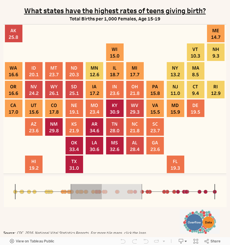
The data for this visualization comes from the National Center for Health Statistics and the Center Disease Control. I found the state data on the CDC’s website and decided to turn it into a tile map. Once I had gathered the data, I used Tableau to create this visualization.
If you want to keep up with our surveys and data analysis, be sure to follow us on Twitter and Facebook.
What states have the highest rates of teens giving birth? #dataviz #TileMapTuesday https://t.co/MkF5gl3648 pic.twitter.com/koecsWsOyC
— Overflow Data (@overflow_data) July 3, 2018
Leave a Reply