Introduction
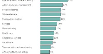
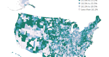
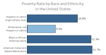
Usually, the economy is gauged based on the unemployment rate. This is only one measure of the economic strength of the labor force. This data viz lets you explore the unemployment rate, what percentage of people are part of the labor force, and what percentage of people aren’t in the labor force.
Visualization
Data Notes
The data for this visualization comes from the U.S. Census Bureau’s 2017 American Community Survey 1-year estimates. For more information visit https://census.gov/acs
I used R to pull the ACS estimates from the Census Bureau API and Tableau to create the visualization.
If you want to keep up with our surveys and data analysis, be sure to follow us on Twitter and Facebook.
Overflow Data’s Employment Data Mapper #dataviz https://t.co/pOpTx71RpL
— Overflow Data (@overflow_data) September 11, 2019


