")
Static Visualizations
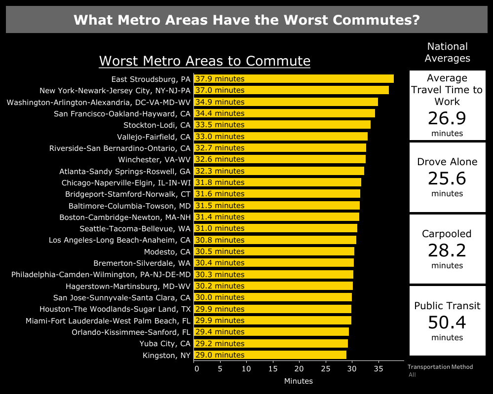
All Commuters
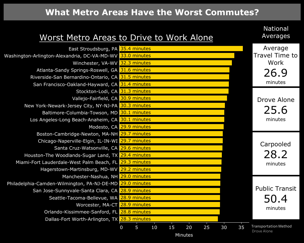
Drove Alone
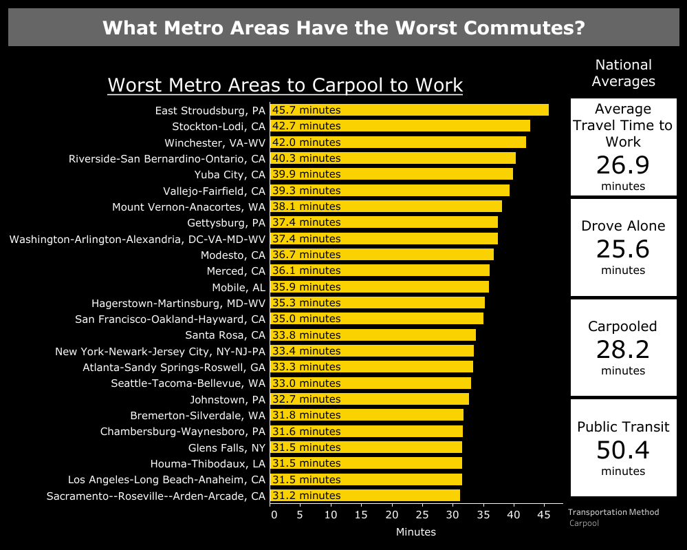
Carpooled
Public Transit
Data Notes
The data in this visualization comes from the American Community Survey which is administered by the U.S. Census Bureau. The data comes from the 2017 1-year estimates and was gathered via the Census Bureau’s API. Once the data was gathered it was cleaned in Excel and visualized using Tableau. An interactive version is available as well.
Leave a Reply