")
Visualization
Mobile Users: If you are having issues with the interactive data viz, static images are also available.
Data Notes
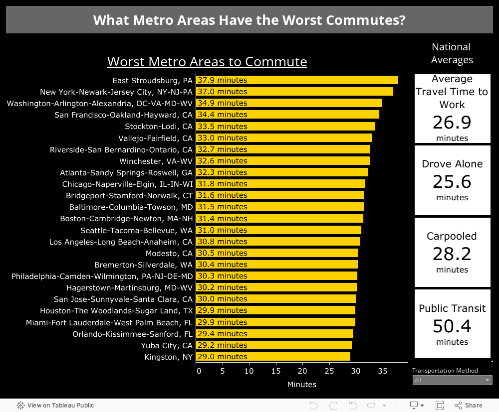
The data in this visualization comes from the American Community Survey which is administered by the U.S. Census Bureau. The data comes from the 2017 1-year estimates and was gathered via the Census Bureau’s API. Once the data was gathered it was cleaned in Excel and visualized using Tableau.
Leave a Reply