Visualization
Data Notes
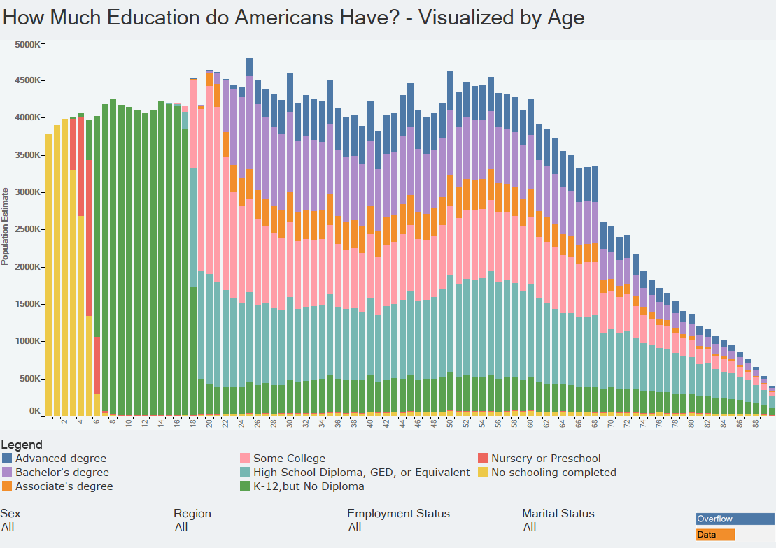
I was interested in visualizing how the highest level of school completed differs based on someone’s age. To do this I gathered data from the American Community Survey which is completed by the US Census Bureau. I used the 2014 One Year Estimates Public Use Microdata Sample, which can be found on the ACS Website. I then used Tableau to visualize the data. If you are interested in more data like this be sure to check out my “How American’s Differ by Age” Data Visualization.
If you want to keep up with our surveys and data analysis, be sure to follow us on Twitter and Facebook.
How Much Education do Americans Have? – Visualized by Age #dataviz https://t.co/mKJom7xBJ9 pic.twitter.com/NhRz590ZEH
— Overflow Data (@overflow_data) November 28, 2016
