Introduction
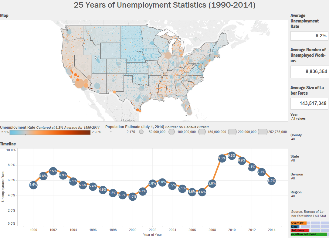
Every month, the Bureau of Labor Statistics publishes data on the unemployment rate in the United States. Usually this number is just compared with the prior month and analysts make bold statements about what this means for the economy. The unemployment rate that we hear on the first Friday of each month is often revised and can have large variances in different parts of the country. I wanted to look into these subtleties and the final data so I found data for every county in the US over the last 25 years. The data visualization below shows you the annualized unemployment rate from 1990-2014.
Visualization
[accordions]
[accordion title=”A Note for Mobile Users” load=”hide”]How to integrate mobile users in the visualization realm continues to be an issue for users and creators. At this current time we are only publishing desktop ready versions of our interactive visualizations. Above you are able to see a static version of a visualizations that is interactive on desktop and laptop computers. We just hope that you use the sharing features below to Facebook, tweet, or email yourself the link so you can enjoy the entirety of visualization later on.[/accordion]
[/accordions]
Source
The data for this visualization comes from the Bureau of Labor Statistics. It is published in the Local Area Unemployment Statistics. After downloading the data, Microsoft Excel and Tableau were used to create this visualization. If you have any questions go ahead and leave me a comment.
If you want to keep up with our surveys and data analysis, be sure to follow us on Twitter and Facebook.
Up Next
How has the US Population Totals Changed Between 2014 and 2015?
