Visualization
Data Notes
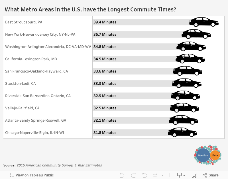
The data for this visualization comes from the American Community Survey which is conducted by the U.S. Census Bureau. The data is available at factfinder.census.gov . I used the 2016 1 year estimate for mean travel time to work found on table DP03. Once I had gathered the data, I used Tableau to create this visualization.
If you want to keep up with our surveys and data analysis, be sure to follow us on Twitter and Facebook.
What Metro Areas in the U.S. have the Longest Commute Times? #dataviz #commuting https://t.co/WAwmFooy6b pic.twitter.com/VuBwwLitJt
— Overflow Data (@overflow_data) December 28, 2017