
Visualization
Data Notes
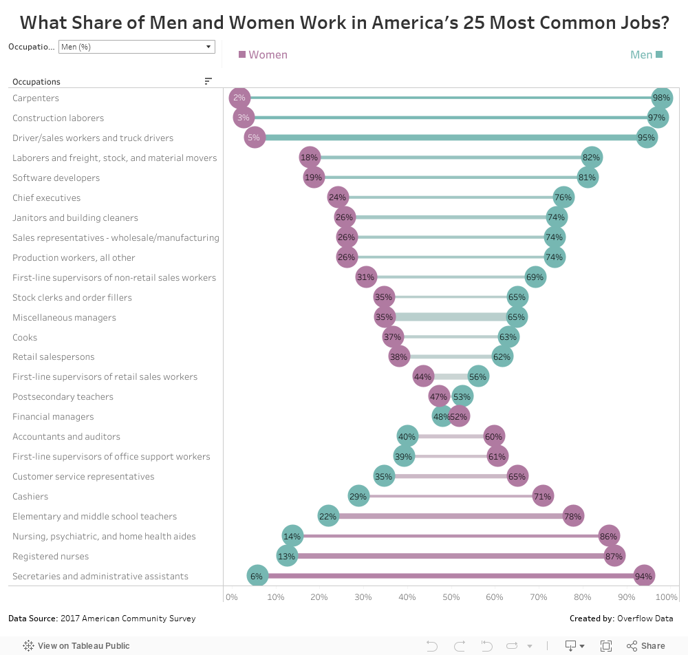
This data visualization explores the differences in what jobs men and woman have. The data for this visualization comes from the U.S. Census Bureau’s 2017 American Community Survey 1-year estimates. For more information visit https://census.gov/acs
Once I had the data, I used Tableau to create the visualization. This visualization is a remix of a visualization I saw on r/dataisbeautiful that looked at the share of men and woman for the 30 most common occupations in Switzerland.
If you want to keep up with our surveys and data analysis, be sure to follow us on Twitter and Facebook.
What Share of Men and Women Work in America’s 25 Most Common Jobs? #dataviz https://t.co/KtTZtRldNT pic.twitter.com/AwnaPu7pEx
— Overflow Data (@overflow_data) July 8, 2019
Leave a Reply