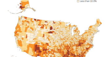
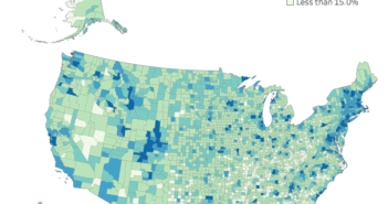
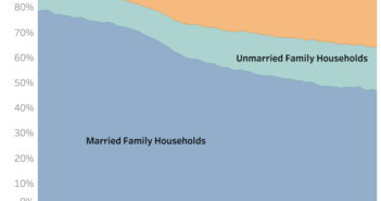
Visualization
Note: This data in this visualization is from the 2015 ACS. A visualization with 2016 data can be found here.
If you are having issues with the interactive visualization, click here for a static image.
Data Notes
The data for this visualization comes from the American Community Survey which is conducted by the U.S. Census Bureau. I used the Census Bureau API to pull the 2015 5 year estimate for the median household income in each U.S. county. Once I had gathered the data, I used Tableau to create this visualization.
I have included the API code I used to pull the data below. Median household income is represented by DP03_0025E. You will may a free API key to access the data. You can find out more at the Census Bureau’s Developer Page.
http://api.census.gov/data/2015/acs5/profile?get=NAME,DP03_0062E&for=county:*&key=
If you want to keep up with our surveys and data analysis, be sure to follow us on Twitter and Facebook.
What U.S. counties have the lowest and the highest median household income? #dataviz https://t.co/jylg3EkQfp pic.twitter.com/r3ntqXIBui
— Overflow Data (@overflow_data) July 6, 2017


