
Visualization
Data Notes
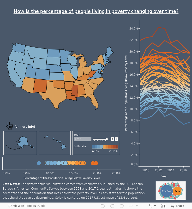
The data for this visualization comes from estimates published by the U.S. Census Bureau’s American Community Survey between 2008 and 2017 1-year estimates. It shows the percentage of the population that lives below the poverty level in each state for the population that the status can be determined. Color is centered on 2017 U.S. estimate of 13.4 percent.
I used R to pull the ACS estimates together and Tableau to create the visualization.
If you want to keep up with our surveys and data analysis, be sure to follow us on Twitter and Facebook.
How is the percentage of people living in poverty changing over time? #dataviz https://t.co/taopxCL9z7 pic.twitter.com/XNS8ZfmdxV
— Overflow Data (@overflow_data) October 6, 2018
Leave a Reply