
Introduction
Last week, I made a visualization detailing the political party preference of each governor, in each state, over the last 25 years. While I felt like it was a pretty cool visualization, I don’t know if it was a great way of showing the political trends. I created the visualization below, that sorts the data by year to better show the trends.
The desktop version of this post has two versions of the same graphic. The first is an interactive version of the visualization. The second shows a gif showing the the animated version of the visualization.
Visualization
[accordions]
[accordion title=”Gif” load=”hide”]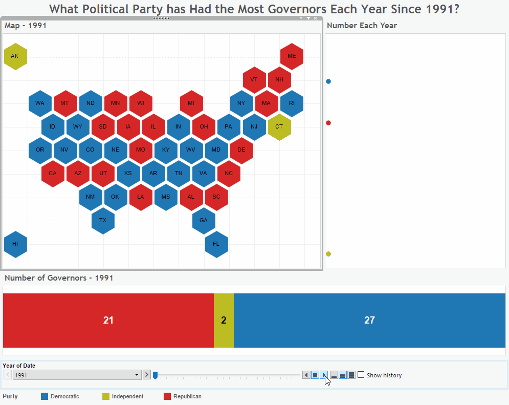 [/accordion]
[/accordions]
Source
To gather the data for this visualization I transcribed the data from Wikipedia. I did this in a by year fashion. I used the logic that I would use the governor that was in office for the majority of the year to code that year. In some cases, certain short term or temporary governors were left out, but party control was almost never exchanged in this instance.
After transcribing the data, Microsoft Excel and Tableau were used to create this visualization. If you have any questions go ahead and leave me a comment.
If you want to keep up with our surveys and data analysis, be sure to follow us on Twitter and Facebook.
Up Next
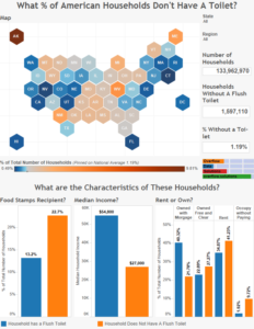
What Percentage of American Households Don’t Have a Toilet?
Leave a Reply