
Visualization
Data Notes
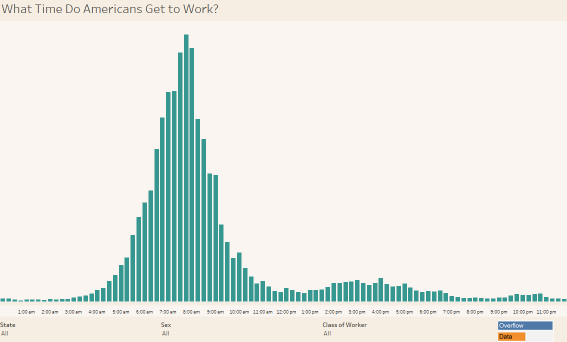
I wanted to create a visualization showing the time that Americans say they arrive at their work place, so I gathered data from the American Community Survey. I used Tableau to create the visualization and excel to help me with some of the data editing. The data comes from the 2015 ACS 1 Year Public Use Microdata Sample which can be found on the ACS Website..
I decided to use ACS PUMS instead of the published data tables because the published tables have unequal time intervals that I think are meant to show fairly similar group sizes. The PUMS data though has this variable broken out into 5 minute time intervals except for three instances where it is a 10 minute interval. I went ahead and combined the data into 15 minute intervals using the Tableau’s calculated field option, some excel functions, and the ACS PUMS Data Dictionary. I also did some work with some other variables so that you can filter the data by state of residency, sex, and the class of worker. The result of this work is shown in the visualization.
Finally, it is worth pointing out that the visualization does not include workers that work at home. The ACS has made the decision not to ask those workers the series of questions that involve commuting.
If you want to keep up with our surveys and data analysis, be sure to follow us on Twitter and Facebook.
What Time Do Americans Get to Work? #dataviz https://t.co/EPNJKBJ1XN pic.twitter.com/NHhXTHj8Rn
— Overflow Data (@overflow_data) January 18, 2017
Leave a Reply