
Visualizations
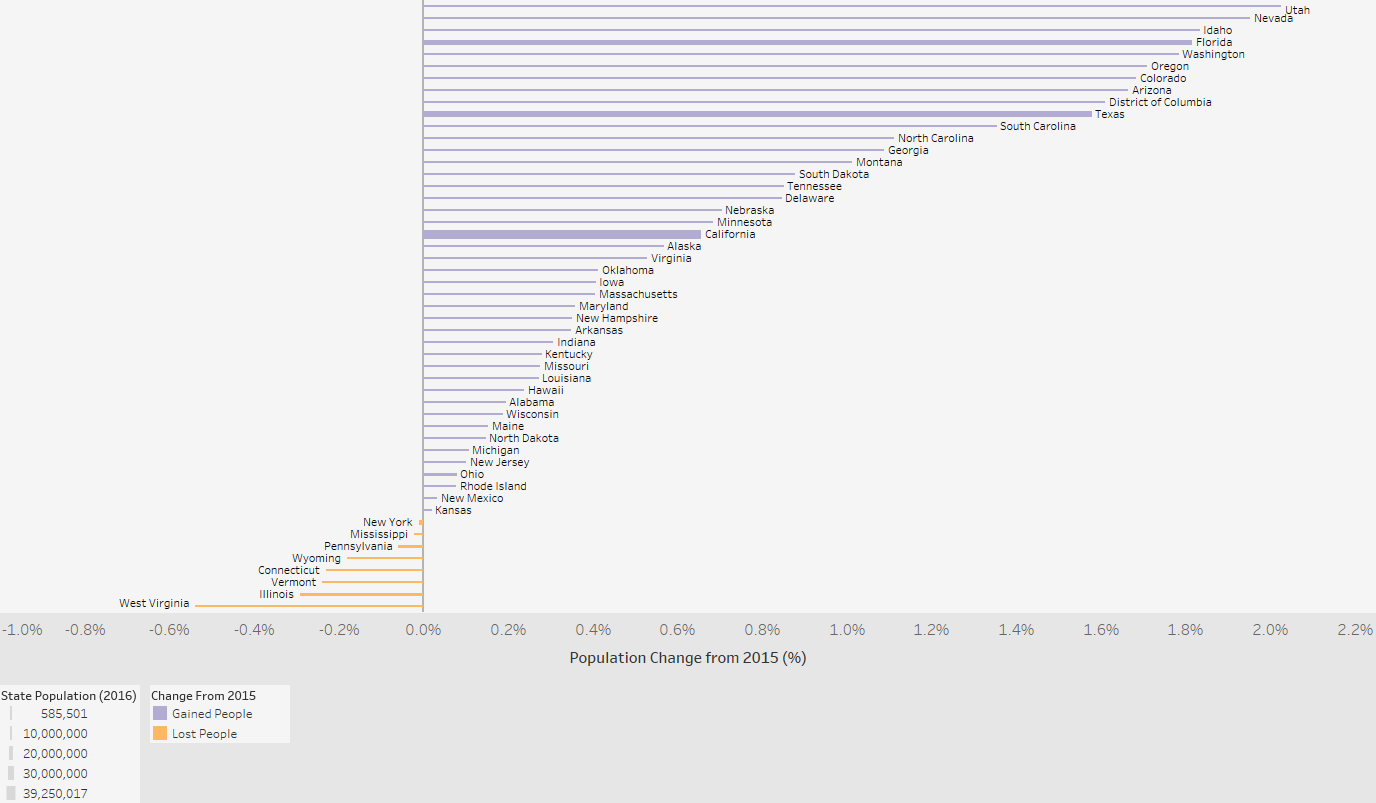
Population Change (%)
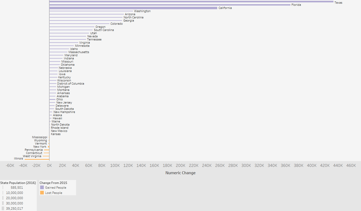
Population Change (#)
Data Notes
The data used in this visualization is compiled by the US Census Bureau which provides population estimates yearly. I used the 2016 population estimate release.This information can be found at factfinder.census.gov under Table PEPANNRES. I used Excel to clean the data and Tableau to create the visualization.
If you want to keep up with our surveys or data analysis be sure to follow us on Twitter and Facebook.
Leave a Reply