Visualization
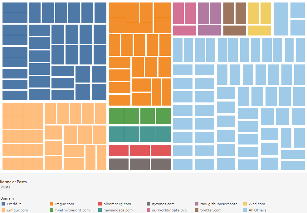
Tree Map
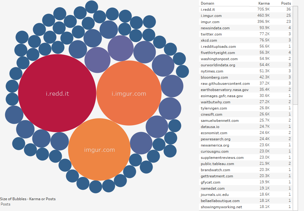
Bubble Chart
Data Notes
I was playing around with using Google Sheets to import xml data and came up with this. It represents what are the most popular domains on r/dataisbeautiful for all posts with more than 10K karma. The way I have it set up, it will not auto update so this is as of 8:00pm 4/4/2017. If you want to access the sheet you can find it here.
After I had the data I used Tableau to create the tree map and the bubble chart. The tree map represents each individual post, and the bubble chart shows the total for each domain. You can change the size to be either the number of posts or the karma received on the desktop version of the visualization.
If you want to keep up with our surveys and data analysis, be sure to follow us on Twitter and Facebook.
What are the most popular domains for @dataisbeautiful top posts ? #dataviz https://t.co/87sWc9emLQ pic.twitter.com/SpWaOGEwwm
— Overflow Data (@overflow_data) April 4, 2017


