
Visualization
Data Notes
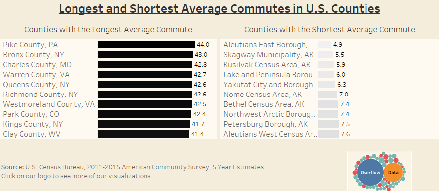
The data for this visualization comes from the American Community Survey which is conducted by the U.S. Census Bureau. I used the Census Bureau API to pull the 2015 5 year estimate for the mean commute time in each county. I then filtered the data down to the ten longest and shortest mean travel times. Once I had gathered the data, I used Tableau to create this visualization.
I have included the API code I used to pull the data below. Mean travel time to work (minutes) is represented by DP03_0025E. You will need a free API key to access the data. You can find out more at the Census Bureau’s Developer Page.
http://api.census.gov/data/2015/acs5/profile?get=NAME,DP03 0025E&for=county:*&key=…
If you want to keep up with our surveys and data analysis, be sure to follow us on Twitter and Facebook.
Leave a Reply