
Introduction
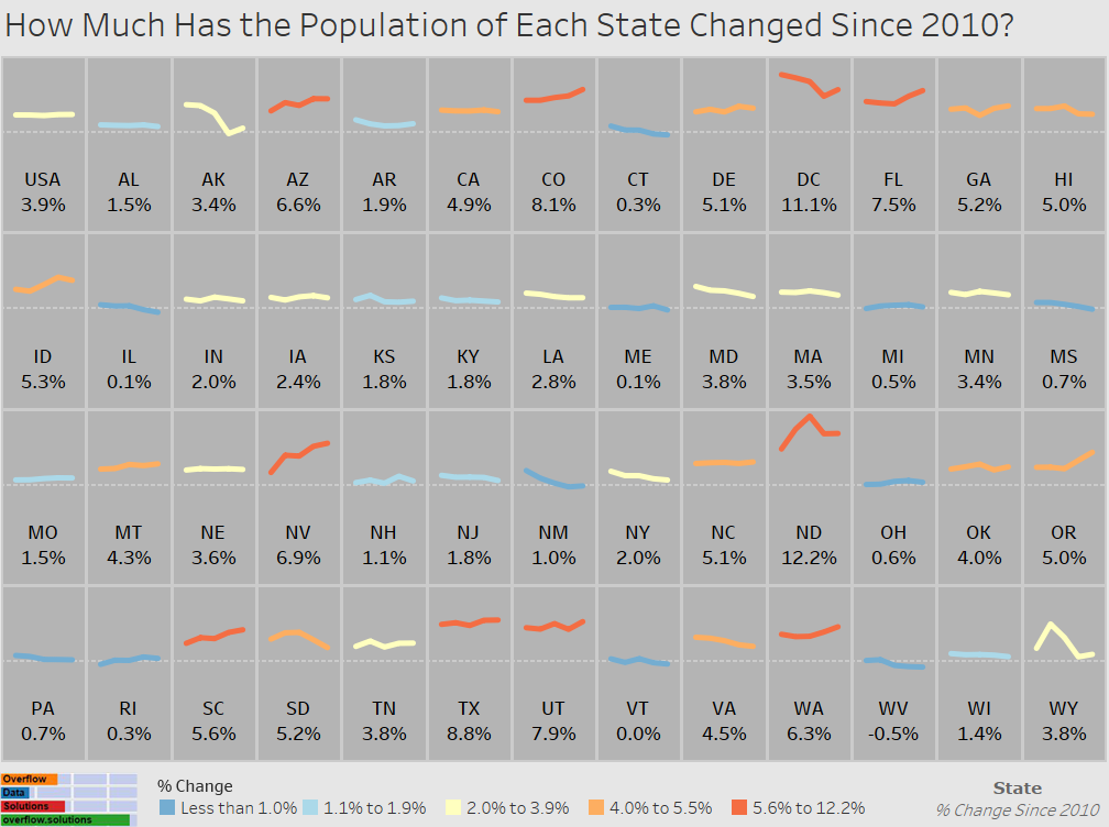
Population is a critical statistical measure in the US. Increases in population can signal prosperity, while decreases can signal problems. This graphic attempts to show how the US population has changed since 2010.
The visualization below shows the percentage change in the population year over year since 2010. The label then shows the total change since 2010 for each state and the country overall.
Visualization
Data Notes
The data used in this visualization is compiled by the US Census Bureau which provides population estimates yearly. I used the 2015 population estimate release which contained data since the 2010 Census. Only the July 1st estimates where utilized in the visualization. This information can be found at factfinder.census.gov under Table PEPANNRES. I used Excel to clean the data and Tableau to create the visualization.
If you want to keep up with our surveys, data analysis, or want more data about education be sure to follow us on Twitter and Facebook.
Leave a Reply