
Visualization
Data Notes
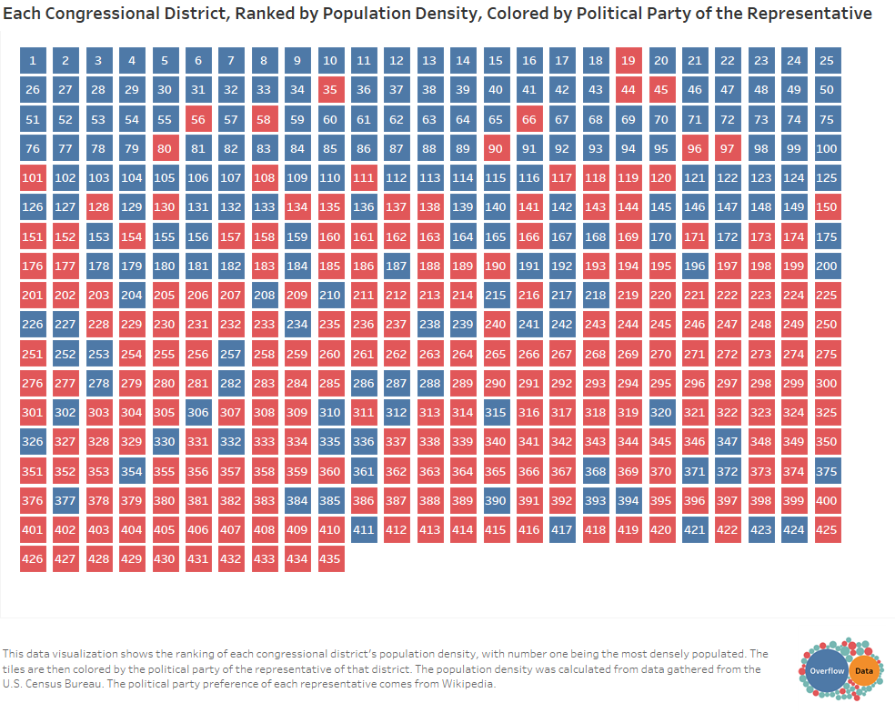
This data visualization shows the ranking of each congressional district’s population density, with number one being the most densely populated. The tiles are then colored by the political party of the representative of that district. The population density was calculated from data gathered from the U.S. Census Bureau. The political party preference of each representative comes from Wikipedia. Once the data was gathered it was cleaned in excel and the visualization was created in Tableau.
If you want to keep up with our surveys and data analysis, be sure to follow us on Twitter and Facebook.
Each Congressional District, Ranked by Population Density, Colored by Political Party of… https://t.co/T58qTFKcPb pic.twitter.com/5eYm48N9Vc
— Overflow Data (@overflow_data) June 1, 2017
Leave a Reply