Visualization
Data Notes
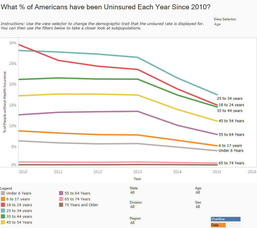
The U.S. Census Bureau recently reported that the American Community Survey (ACS) estimates that 9.4% of Americans don’t have health insurance coverage. This is an all time low because of the passage of the ACA. Like other statistics though, different groups have a different percentage of people that are uninsured. This visualization lets you explore the number of people that are uninsured by Age.
To create this data visualization I gathered data from the ACS on American Fact Finder. I used Table B27001 from 2010 to 2015. I then used Tableau to visualize the data. If you are interested in more data like this be sure to check out my “How American’s Differ by Age” Data Visualization.
If you want to keep up with our surveys and data analysis, be sure to follow us on Twitter and Facebook.
What Percentage of Americans have been Uninsured Each Year Since 2010? #dataviz https://t.co/LRgF9kw2Ty pic.twitter.com/j9me5df6qX
— Overflow Data (@overflow_data) December 6, 2016


