
Introduction
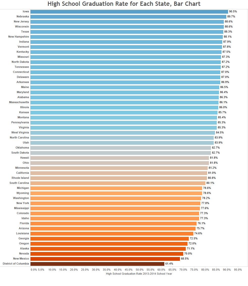
The need to complete High School has essentially become a universal value in the United States. Even though this is the case, the High School Graduation Rate can differ more than 20% between states. Below you can find visualizations showing how the 2013 – 2014 graduation rate compares in each state.
Visualizations
Map
Bar Chart
Source/Methodology
The data for these visualizations come from The National Center for Educational Statistics. The data was entered into excel and cleaned. From there I loaded it in Tableau. This is the finished product.
If you want to keep up with our surveys and data analysis, be sure to follow us on Twitter and Facebook.
Leave a Reply