
Visualization
Mobile Users: If you are having issues using the interactive version of this visualization, you can find a static version of it here.
Data Notes
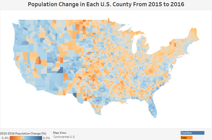
The U.S. Census Bureau recently released population estimates for July of 2016. We decided to take a look at how the population has changed since 2015. The visualization below utalizes Excel and Tableau to show the percentage population change for each U.S. County.
If you want to keep up with our surveys and data analysis, be sure to follow us on Twitter and Facebook.
Population Change in Each U.S. County From 2015 to 2016 #dataviz https://t.co/nyVViacvJ1 pic.twitter.com/ZHTNDU2rYP
— Overflow Data (@overflow_data) April 7, 2017
Leave a Reply