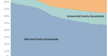
Visualization
If you are having issues with the interactive visualization, click here for a static image.
Data Notes
Recently, I have wanted to try to make some data visualizations with tile maps. I have used this post to create some tile maps that quickly see the how many times people have been married in each state. To create this graphic I used Tableau and data from the American Community Survey which is conducted by the US Census Bureau. I used the 2015 1 Year Estimates for each state which can be found on American Fact Finder under Table B12505.
If you want to keep up with our surveys and data analysis, be sure to follow us on Twitter and Facebook.
How Many Times Have People Been Married in Each State? #dataviz https://t.co/8suFDFUz51 pic.twitter.com/UBdaHARyZb
— Overflow Data (@overflow_data) May 22, 2017


