
Visualization
Data Notes
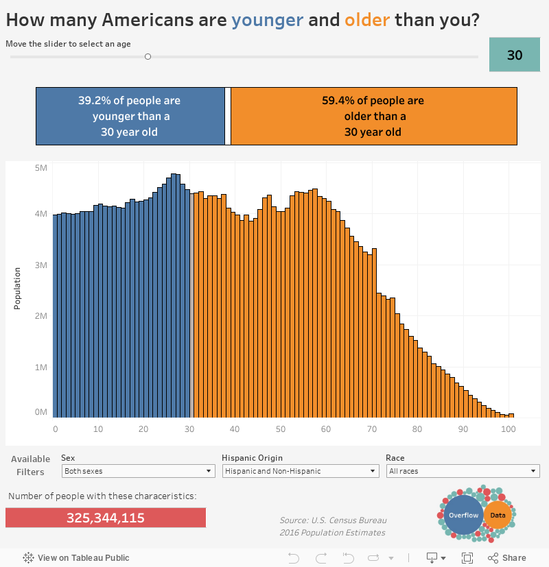
I recently was looking around at some Tableau visualizations and came across “Are you over the hill?”. I thought it was a great visualization and wanted to add my own spin on it with new data so I updated it with new data, a new color scheme, and some new filters.
To create this visualization I used U.S. Census Bureau estimates for the month of July 2016. I utilized the Census Bureau API to pull the estimates by age, sex, race, and Hispanic origin. Once I had gathered the data, I used Tableau to create this visualization. I have included the API code I used to pull the data below. You will may a free API key to access the data. You can find out more at the Census Bureau’s Developer Page.
https://api.census.gov/data/2016/pep/natmonthly?get=POP,AGE,SEX,HISP,RACE&for=us:*&MONTHLY=81&key=
If you want to keep up with our surveys and data analysis, be sure to follow us on Twitter and Facebook.
How many Americans are younger and older than you? #dataviz https://t.co/D5AiQA2PWk pic.twitter.com/IS153SnL5c
— Overflow Data (@overflow_data) September 9, 2017
Leave a Reply