
Visualization
Data Notes
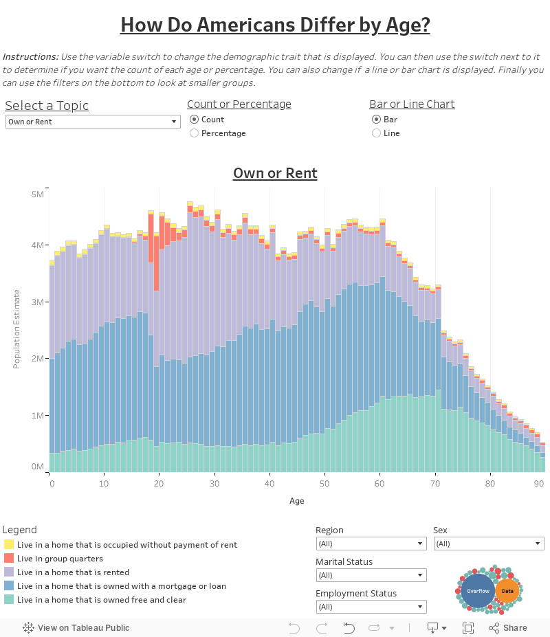
The last few years, I have created tools that imposes different demographic and socioeconomic traits on the population pyramid. Since then new data has been released so I wanted to update the tool. Along with the new data, there toggles that allow you to adjust the characteristic and how the data is displayed. The filters on the bottom adjust the pyramid to only show certain populations. If you want the visual to only show one characteristic or exclude a trait, simply click it in the legend and keep or remove it.
The data for this tool uses the 2017 Public Use Microdata Sample (PUMS) published by the American Community Survey. Tableau is used as the data visualization platform. You can find information about the ACS PUMS at the Census Bureau’s website. On the site there is information about the survey, summary level data, and how to use the PUMS data.
I plan on continually updating this tool. If there are any traits that you are interested in seeing, let me know and I would be happy to set it up. Also, since this is an ongoing project, any suggestions you have on how to make the visualization better are welcome. Leave a comment below, or tweet at us @overflow_data.
If you want to keep up with our surveys or data analysis be sure to follow us on Twitter and Facebook.
How Do Americans Differ by Age? #DataViz https://t.co/uyJ22mUw8D pic.twitter.com/eWxEUW1dwv
— Overflow Data (@overflow_data) January 9, 2019
Leave a Reply