Introduction
Earlier this week, I created a visualization that showed what people were moving to each state. As part of this, it was pointed out to me that most of the people that were moving where young adults. I am extremely interested in demographics and why people move around the United States so I thought this would be a great thing to explore with another visualization.
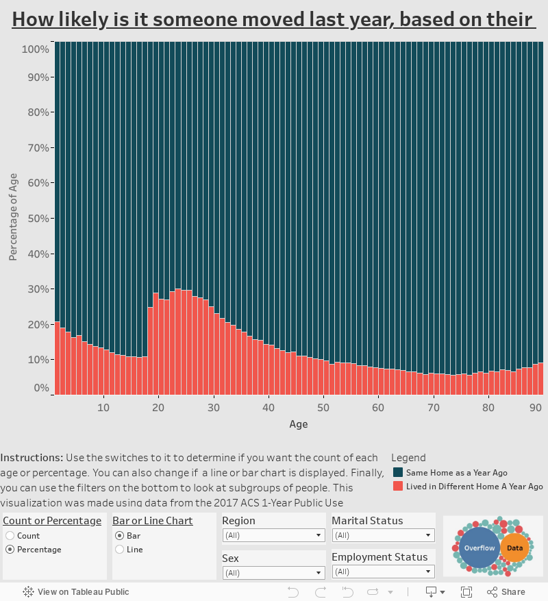
From our visualization we are able to see that the mobility rate seems to drop after someone is born all the way until they turn 18. At this point it shoots up to its highest levels through young adulthood. Likely because of people going to college, getting married, and finding new jobs. The rate then decreases until it looks like there is a slight increase later in live. Possibly from people moving into assisted living. Check out the visualization to see these trends and explore how region, marital status, employment status, and sex can all play a roll in adjusting these rates.
I hope you enjoy the visualization below. If you see anything you want to let us know, feel free to comment or reach out to us on Twitter.
Visualization
Mobile Users: If you are having issues viewing this on your device, try rotating your screen.
Data Notes
I used the 2017 ACS One Year Public Use Microdata Sample to create this visualization. The data can be found on the ACS Website. I then utilized Tableau to visualize the data.
If you want to keep up with our surveys and data analysis, be sure to follow us on Twitter and Facebook.
How likely is it someone moved last year, based on their age? #dataviz https://t.co/LAGzexDcNG pic.twitter.com/0rBWzykXNr
— Overflow Data (@overflow_data) March 9, 2019