[accordions]
[accordion title=”A Note for Mobile Users” load=”hide”]How to integrate mobile users in the visualization realm continues to be an issue for users and creators. At this current time we are only publishing desktop ready versions of our graphics. That doesn’t mean we don’t want you to see them. We just hope that you use the sharing features below to facebook, tweet, or email yourself the link so you can enjoy the visualization later. A mobile friendly version of this data is located here[/accordion]
[/accordions]
Further Information
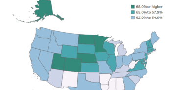
We have pointed out the county with the highest and the lowest median household income. You can get more detailed data on every county though just by hovering over the data point. It has information on County Name and Average Percentage of Income Spent of Rent
Source
To determine an estimate of what the average person earns and spends on rent I utilized data provided by the American Community Survey with is conducted by the United States Census Bureau. The data sets can be found at http://factfinder.census.gov.
The first data set used was labeled, Median Household Income in the Past 12 Months (In 2014 Inflation-Adjusted Dollars), Table B19013. The second data set was labeled Median Gross Rent (Dollars), Table B25064. The estimation of percentage of income used on rent was tabulated by multiplying the Rent amount by 12 and dividing my the median income. The 2010-2014 5 year estimates were used since they are the most recent data available from the American Community Survey that can be used for every county. The visualization is representative of data collected in that time period.
Once the data was downloaded it was manipulated in Microsoft Excel. It was then loaded into Tableau where I rendered the visualizations and added filters.


