[accordions]
[accordion title=”A Note for Mobile Users” load=”hide”]How to integrate mobile users in the visualization realm continues to be an issue for users and creators. At this current time we are only publishing desktop ready versions of our graphics. That doesn’t mean we don’t want you to see them. We just hope that you use the sharing features below to facebook, tweet, or email yourself the link so you can enjoy the visualization later. A mobile friendly version of this data is located here[/accordion]
[/accordions]
Filters and Controls
Map Controls
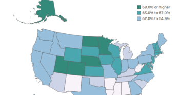
In the upper left hand corner of the map, you are able to zoom in and out, lock the map in place, and select an area of data points. When you select data points you are able to filter based on that selection.
State Filter
The state filter allows you to filter down to an individual state. As long as the map hasn’t been locked, both visualizations will then adjust to this selection.
County Filter
If you have an interest in a particular county you are able to find it here. Selecting a county using this filter will remove all other counties and allow you to focus directly on the point of interest.
Source
The data for this visualization comes from the American Community Survey with is conducted by the United States Census Bureau. The data set can be found at http://factfinder.census.gov. It is labeled, MEDIAN HOUSEHOLD INCOME IN THE PAST 12 MONTHS (IN 2014 INFLATION-ADJUSTED DOLLARS), Table B19013. The 2010-2014 5 year estimates were used since they are the most recent data available from the American Community Survey that can be used for every county. The visualization is representative of data collected in that time period.
Once the data was downloaded it was manipulated in Microsoft Excel and Access. Once it was in a usable form, it was loaded into Tableau where I rendered the visualizations and added filters.


