Introduction
I recently completed a visualization looking at the migration status of Americans by age. I wanted to look at what other traits can cause there to be differences in the number of people that are moving. While I was playing with the data I came across another demographic trait that has an effect on mobility, marital status.
The American Community Survey estimates that 14.9% of people live at a different home than they did 12 months ago. The visualization below lets you see how mobility changes with marital status. You can also use the filters to take a closer look at age, race, and state of residence.
Visualization
Mobile Users: If you are having issues using the interactive version of this visualization, you can find a static version of it here.
Data Notes
The data for this visualization comes from the American Community Survey which is completed by the US Census Bureau. I used the 2014 One Year Estimates Public Use Microdata Sample which can be found on the ACS Website. This visualization uses Tableau to show the migration status of people by martial status.
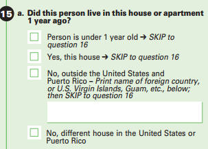
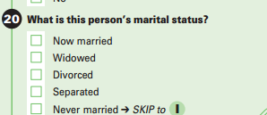
The visualization groups individuals into 2 groups: those who aren’t at a different address than the one they had 12 months ago and those who have moved to a different address than the one they had 12 months ago. Children under 15 years old are not included. Images of the survey questions have been included below.
[columns]
[column size=”1/2″]
Migration Status
[/column]
[column size=”1/2″]
Marital Status
 [/column]
[/columns]
You can find more visualizations about marital status and mobility by clicking the links.
If you want to keep up with our surveys and data analysis, be sure to follow us on Twitter and Facebook.