Visualization
Data Notes
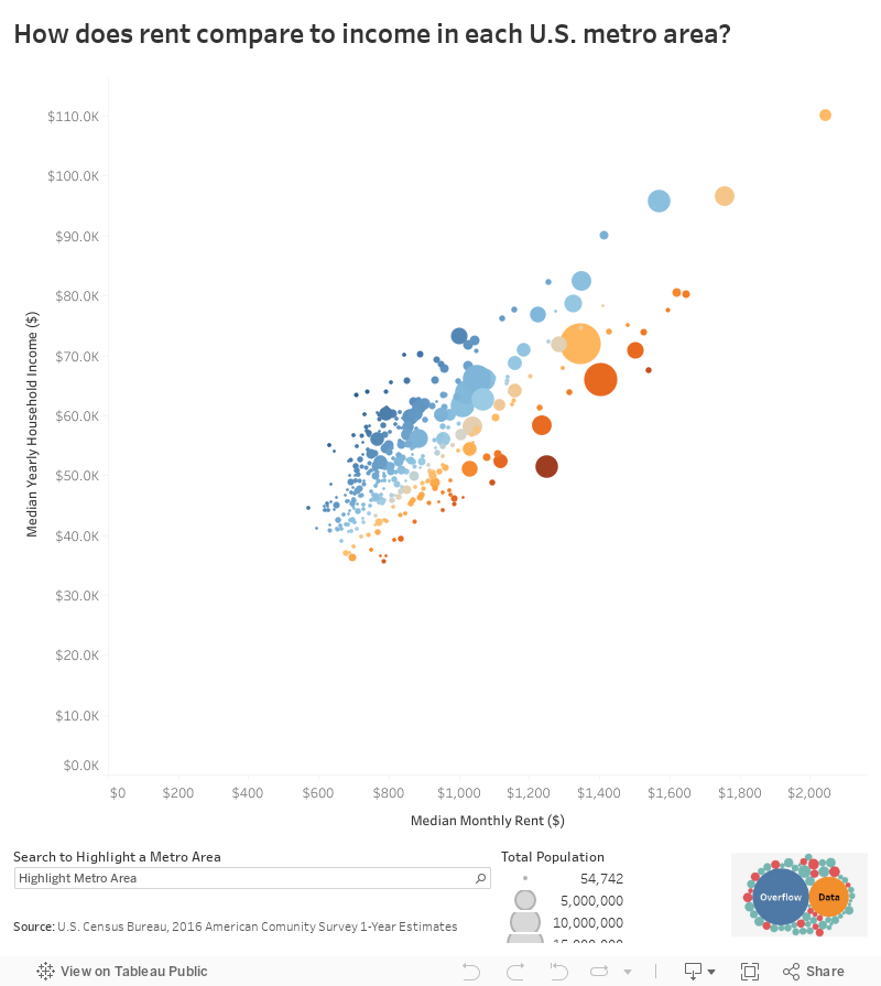
I’m trying to do some more data visualizations that focused on metro areas. In the past, I have made visualizations showing how rent relates to income in each U.S. county. This year though, I decided to make a visualization looks at this by metro area. The data in this visualization comes from the 2016 American Community Survey 1-Year Estimates. Once I had the data, I used Tableau to visualize it.
If you want to keep up with our surveys and data analysis, be sure to follow us on Twitter and Facebook.
How does rent compare to income in each U.S. metro area? #dataviz https://t.co/tc8Syg3ikc pic.twitter.com/gk6DukcGJx
— Overflow Data (@overflow_data) April 17, 2018