Introduction
Every month, the Bureau of Labor Statistics publishes data on the unemployment rate in the United States. Usually this number is just compared with the prior month and analysts make bold statements about what this means for the economy. The unemployment rate that we hear on the first Friday of each month is often revised and can have large variances in different parts of the country. I wanted to look into these subtleties and the final data so I found data for every county in the US over the last 25 years. The data visualization below shows you the annualized unemployment rate from 1990-2014.
Visualization
Visualization Controls
The visualization allows you to control the years presented and the geographies. When first loaded, it is displaying the average unemployment rate from 1990-2014 for every county in the US. You are able to filter based by year though and this will change the map and the numbers that are displayed. If you want to see the information for a single year, just select the same year in the filter.
Source
The data for this visualization comes from the Bureau of Labor Statistics. It is published in the Local Area Unemployment Statistics. After downloading the data, Microsoft Excel and Tableau were used to create this visualization. If you have any questions go ahead and leave me a comment.
If you want to keep up with our surveys and data analysis, be sure to follow us on Twitter and Facebook.
Up Next
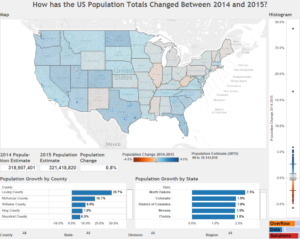
How has the US Population Totals Changed Between 2014 and 2015?