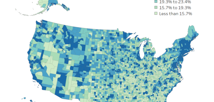
What Counties in the U.S. Are the Most Educated?
The word, “educated” means different things to people. This visual shows how educated people are in each county for different benchmarks.

The word, “educated” means different things to people. This visual shows how educated people are in each county for different benchmarks.
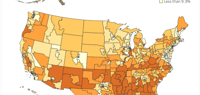
Explore the data on poverty in the each congressional district and discover which elected officials represent areas with the high poverty.
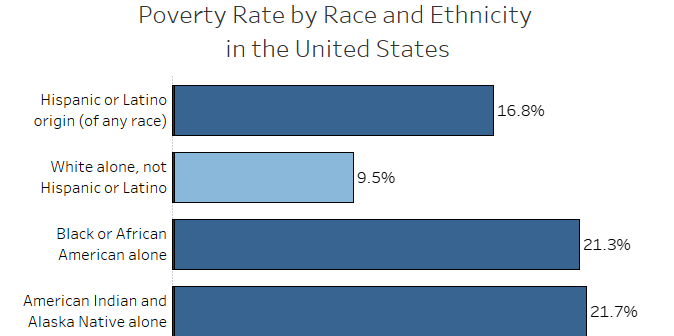
This data visualization allows you to explore various topics by different racial and ethnic groups in the United States and each state.
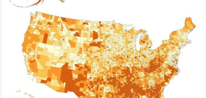
Explore the latest data on poverty in the United States and discover which counties bear the highest poverty rates.