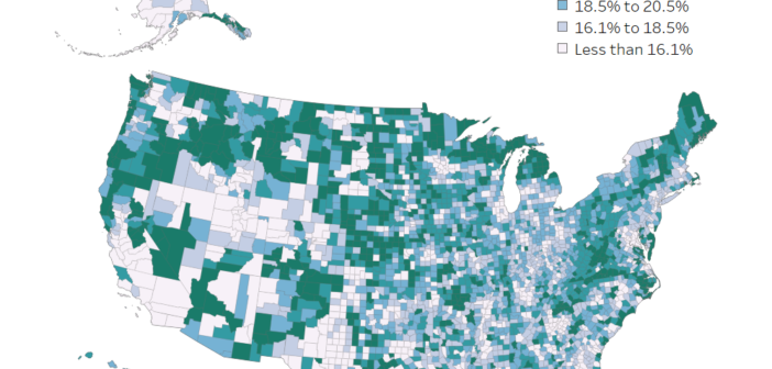
Which U.S. Counties Have the Oldest Populations?
Dive into our latest visualization mapping U.S. counties with the oldest populations. Uncover insights from the 2022 ACS 5-year estimates.

Dive into our latest visualization mapping U.S. counties with the oldest populations. Uncover insights from the 2022 ACS 5-year estimates.
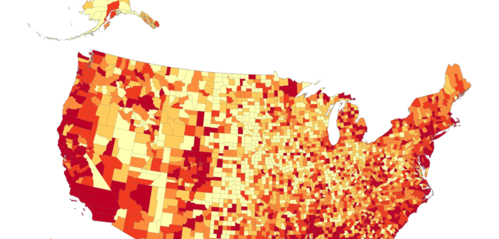
Explore housing affordability trends effortlessly with our interactive visualization. Uncover key economic insights in U.S. counties. Dive into the data for a quick understanding of housing challenges.
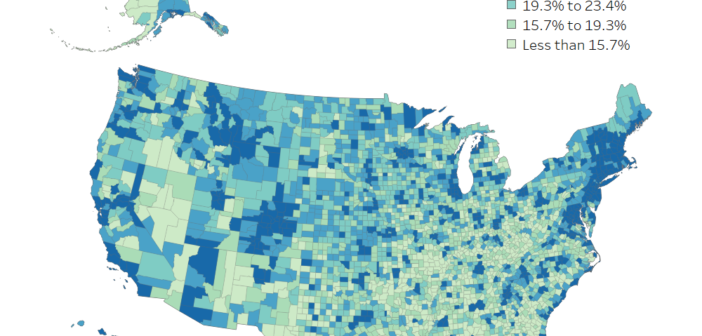
The word, “educated” means different things to people. This visual shows how educated people are in each county for different benchmarks.
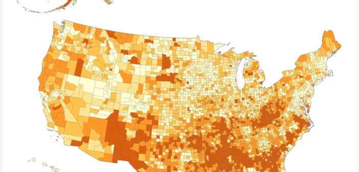
Explore the latest data on poverty in the United States and discover which counties bear the highest poverty rates.