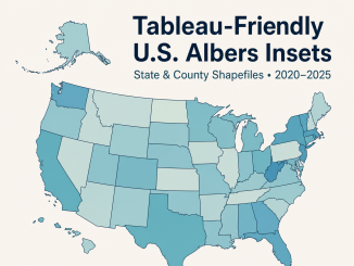
Tableau-Friendly U.S. Shapefiles
Have you every wanted a ready-to-use spatial file collection for Tableau. Overflow Data has you covered.
Have you every wanted a ready-to-use spatial file collection for Tableau. Overflow Data has you covered.
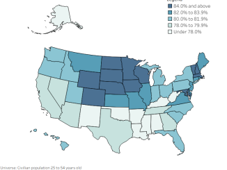
Explore state economic conditions with THRIVE, using labor force participation, prime-age employment, and unemployment data to compare opportunity across states.
Explore THRIVE, an Overflow Data project tracking the relationships, vitality, and essentials that help communities prosper and flourish.
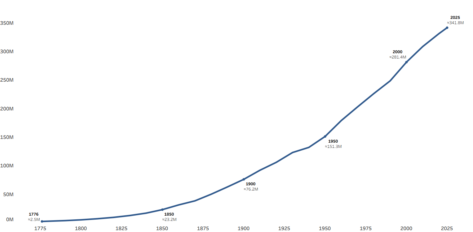
America started with about 2.5 million people in 1776, now the country has more than 350 million people. Here is a look at that growth over the last 250 years.
Copyright © 2026 | WordPress Theme by MH Themes