Visualization
Mobile Users: If you are having issues using the interactive version of this visualization, you can find a static version of it here.
Data Notes
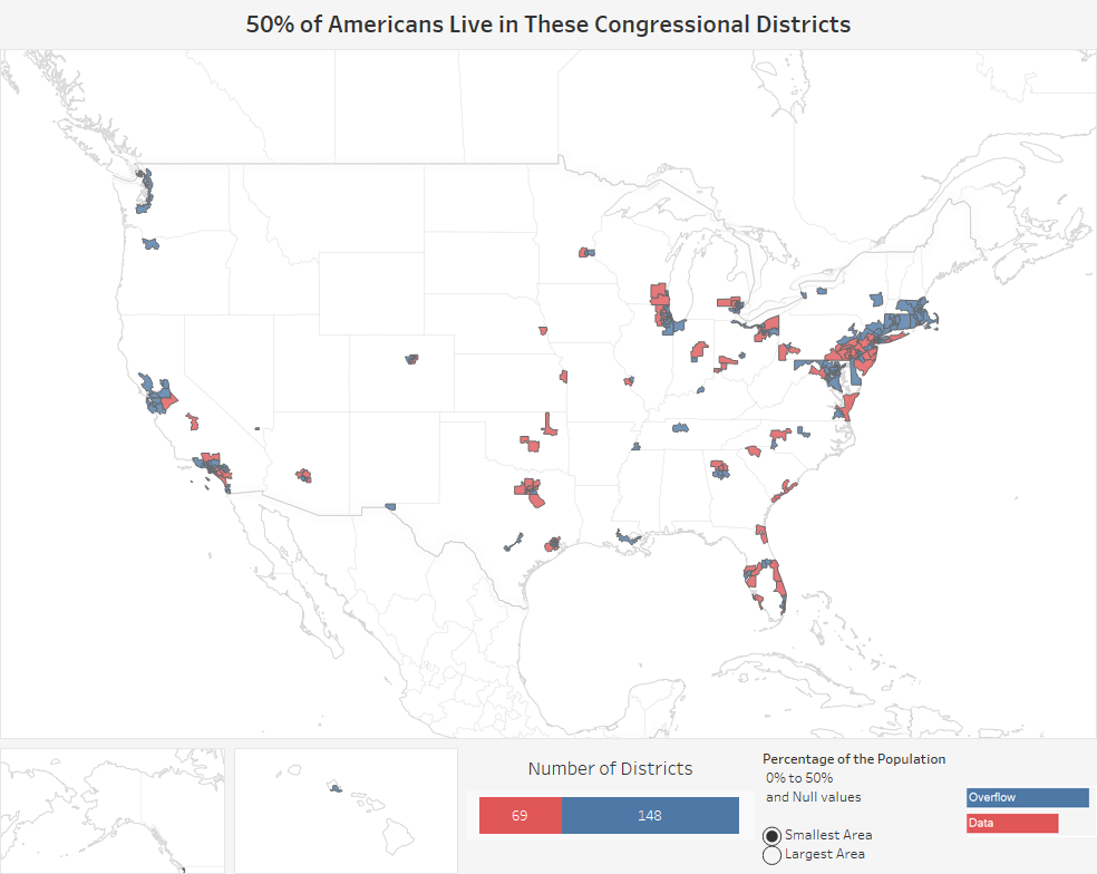
I have seen some pretty cool data visualizations lately that show how small or large an area a certain percentage of the population lives in. This has made me wonder if it has any correlation with political party preference in the U.S., so I put together this visualization that shows the size of each congressional district.
The visualization allows you to adjust the percentage of the population you want to observe. You can then select if you want to see the largest or the smallest area for which that percentage of people live.
I gathered the data for this tool from the Census Bureau’s geography data that provided data on the total land area of each of the congressional districts. I then used Excel to clean the data and Tableau to visualize it. Since there have been changes to congressional districts boundries in 4 states since the last population estimates were put out, I went ahead and built the visualization on the premise that the population of all the congressional districts are the same even though there are some differences. Since this is the case, the percentage of the population estimate should be treated as a rough, but decent estimate of the population.
If you want to keep up with our surveys and data analysis, be sure to follow us on Twitter and Facebook.
What % of Americans Live in These Congressional Districts? #dataviz https://t.co/TNrMGL40JB pic.twitter.com/eqmYlB6Y6m
— Overflow Data (@overflow_data) April 11, 2017