Mobile Users: If you are having issues using the interactive version of this visualization, you can find a static version of it here.
Data Notes
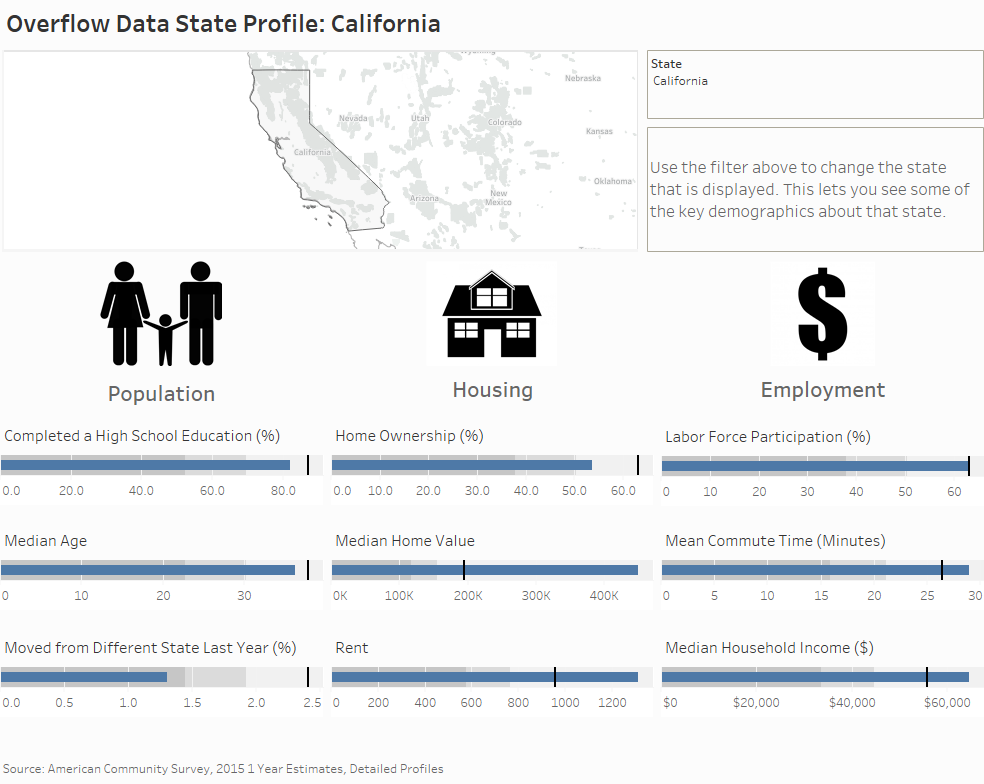
I wanted to create a visualization that could be used to compare some of the traits of each state to the U.S. average. This visualization takes some of the demographic traits I am most interested in and allows you to look at how it compares.
To create this data visualization I gathered data from the American Community Survey. I used the 2015 ACS 1 years estimates from the Census Bureau’s API. I then manipulated the data in excel and used Tableau to visualize the data.
If you want to keep up with our surveys and data analysis, be sure to follow us on Twitter and Facebook.
How does your state compare to the rest of the U.S.? #dataviz https://t.co/0ZRwWdjW7s pic.twitter.com/vQaaAx8oLx
— Overflow Data (@overflow_data) February 28, 2017