Visualization
Data Notes
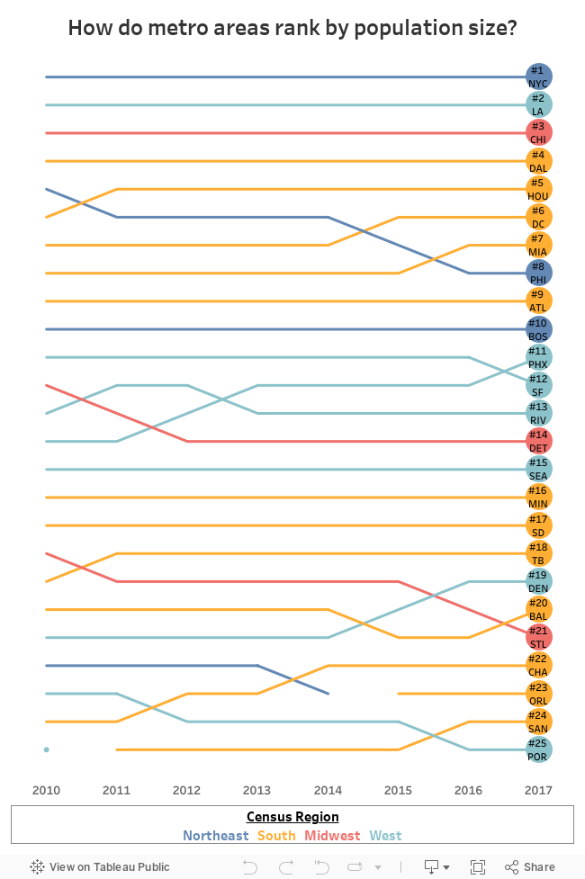
I have been doing more data visualizations that focused on metro areas. This visualization looks at how the ranking of metro area by population size has changed since 2010. The data in this visualization comes from the U.S. Census Bureau’s Population Estimates. Once I had the data, I used Tableau to visualize it.
If you want to keep up with our surveys and data analysis, be sure to follow us on Twitter and Facebook.
How do metro areas rank by population size? #dataviz https://t.co/0Y1BQQBOZI pic.twitter.com/pUukFrl4yb
— Overflow Data (@overflow_data) April 17, 2018