Aging in America: State-by-State Analysis of Aging Population
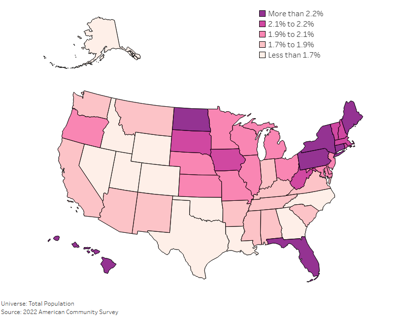
As America continues to shift demographically, the aging population has become a much larger focus for policy makers. Understanding where the oldest Americans live, and […]
As America continues to shift demographically, the aging population has become a much larger focus for policy makers. Understanding where the oldest Americans live, and […]
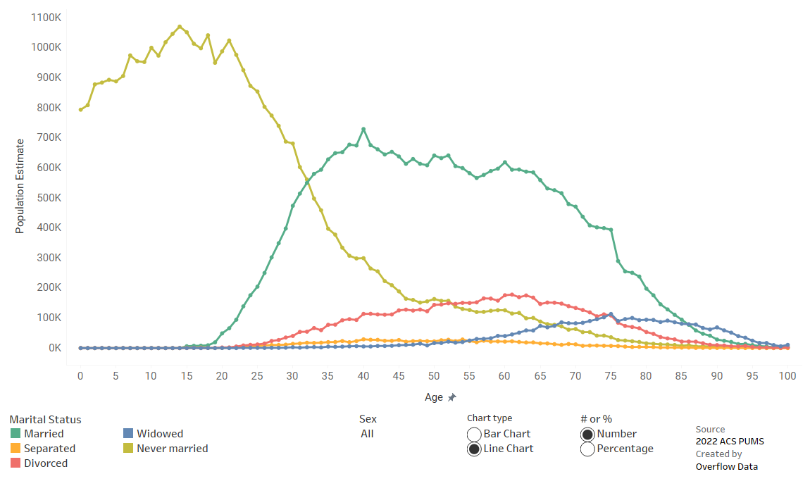
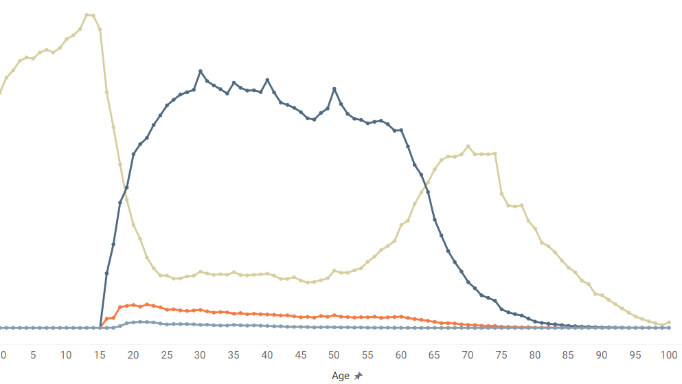
Changes in marital status certianly isn’t caused by age, but it does appear to be related. This visualization explores that relationship.
When you start and stop working has a lot to do with your age. This data viz shows how employment can differ by age for the average American.
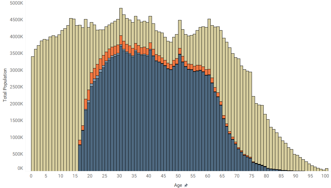
We all know that there are stages to life. This visualization gives us a look at the data behind the changes we go through.
Copyright © 2026 | WordPress Theme by MH Themes